Making content planning easy and strategic

Making content planning easy and strategic
Making content planning easy and strategic

Summary
For communications professionals, planning is one of the hardest parts of the job. They struggle with collecting, organizing, and moving content amid constant changes and inefficient processes. The platform at the time fell short in offering flexible content management, a dedicated space for storing upcoming materials, and the visibility needed for effective short-term planning. To meet this challenge, I led design on the Series Planner — a tool that empowers users to centralize content planning, adapt to changes quickly, and shift from reactive chaos to strategic execution.
Role
Design lead, UX/UI design, Visual design, User research, Product Management, Project management
Team
Input from Director of Product Design, Chief Product Officer, 3 Engineers
Timeline
3 months, 2025
Background
Axios HQ is an internal communications platform that helps teams create and distribute engaging messages. Powered by Smart Brevity® (a writing methodology pioneered by Axios media) it helps communicators achieve stronger open rates, clearer updates, and better alignment across organizations.
To drive its value and competitive edge, Axios HQ needed to position itself as more than an email tool. Insights from customer analysis highlighted the need for a strategic planning feature, one that would deepen our product’s value as a core tool for communications teams.
Discovery
Analysis of customer interviews and usage data revealed that planning communications is a complex, fragmented process for most users—especially for small, often overburdened comms teams. While the product excels at helping users draft and distribute high-quality content, it lacked the dedicated planning infrastructure needed to manage content upstream, before it's ready to send. As a result, users were relying on messy workarounds, which was causing friction, lost content, and missed deadlines.
Discovery
Analysis of customer interviews and usage data revealed that planning communications is a complex, fragmented process for most users—especially for small, often overburdened comms teams. While the product excels at helping users draft and distribute high-quality content, it lacked the dedicated planning infrastructure needed to manage content upstream, before it's ready to send. As a result, users were relying on clunky workarounds, which causes friction, lost content, and missed deadlines.
The key problems

Fragmented planning tools
Users rely on third-party project management tools to map out their comms schedules. This creates a disjointed workflow between planning and publishing.
Users rely on third-party project management tools to map out their communication schedules. This creates a disjointed workflow between planning and publishing.

Restricted content movement
As priorities shift, users need to reshuffle content frequently—but moving content between drafts in the platform is cumbersome and limited.

No place for early ideas
To capture rough ideas, users turn to external tools or store them in a placeholder draft, which often become cluttered and hard to manage over time.
Past solutions fell short
We launched a "target send date" feature in 2023 to support easier sorting and planning. However, low usage data indicated that it did not effectively address our user’s core planning needs.

Hard to see what’s next
Existing views (calendar and table) lacked the necessary context for users to quickly evaluate what content is scheduled or identify what still needed to be covered.
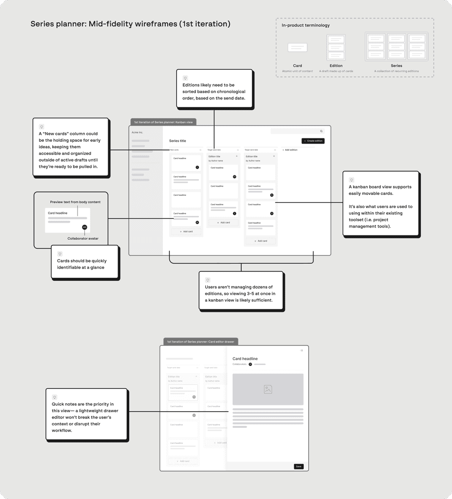
Ideation
My first step was to understand the full picture of our users’ planning process. I mapped their workflows across both Axios HQ and external tools to pinpoint where and how our product could better support their needs.
Ideation
My first step was to understand the full picture of our users’ planning process. I mapped their workflows across both Axios HQ and external tools to pinpoint where and how our product could better support their needs.
Ideation
My first step was to understand the full picture of our users’ planning process. I mapped their workflows across both Axios HQ and external tools to pinpoint where and how our product could better support their needs.

I worked with the Product team to define Job-to-be-done statements that we want to prioritize:
When I'm reviewing my comms schedule, I want a clear, visual way to map out editions, so that I can better plan and prioritize what’s going out next.
When I’m organizing content in the short-term, I want to quickly see the content of each edition without clicking into them, so that I can understand the full picture at a glance.
When priorities change, I want to easily move content between editions, so that I can quickly adjust plans without friction.
When I’m planning ahead, I want to see how upcoming weeks are shaping up, so that I can identify content gaps and follow up with contributors early.
When I have ideas or content that isn’t ready to publish, I want a place to store them, so that I don’t lose track or clutter my active editions.
I then jumped into wire-framing the main UI based on assumptions and known user needs.

Research insights
We conducted user interviews using static designs, as well as usability tests with an interactive prototype with 12+ customers and prospects, which helped validate the concept early and informed subsequent design decisions.
Questions we set out to answer via research:
Do users intuitively understand that each column represents an edition?
How would users expect to be able to navigate to the content editor from here?
What essential information do users need to see on card previews to make informed decisions? What details can we omit without hindering their workflow?
What contextual card actions do users most frequently want to perform?
To what extent do users expect to handle content editing within the card drawer vs. the full content editor? How might this impact their existing content creation habits?
What sorting options best align with how users organize their content pipeline?

Testing the Series Planner design via remote user interviews

Immediate delight
The kanban-style board resonated strongly as a planning tool, especially because it allows for easy card movement between editions as priorities shift.
"This is amazing, this is exactly how we plan. I like this view — it’s super clean and it’s a really nice way to wrap your head around future editions."
- User A from Company A
Card previews needed refinement
Users ranked images as the most important and preview text as the least important information needed when quickly identifying cards.
Modifying card proportions based on this preference also helps reduce card height and minimize scrolling, which is helpful for users managing long editions.
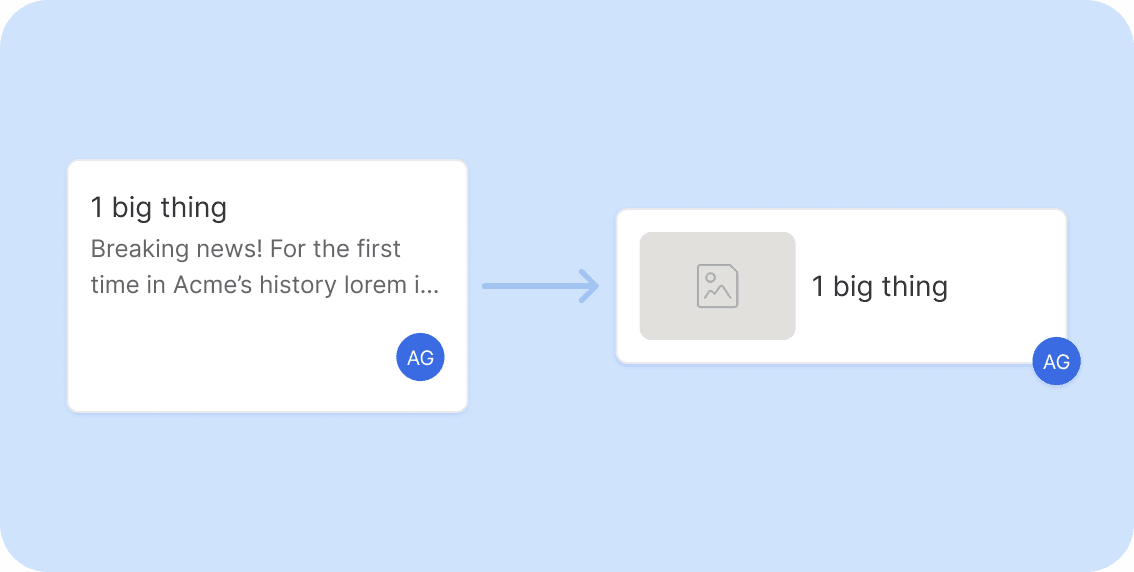
Collaborators over authors
Recurring senders didn't prioritize features like bylines, as their authorship remains consistent across editions. Instead, users want the ability to assign cards to collaborators directly from the planning view to streamline coordination.
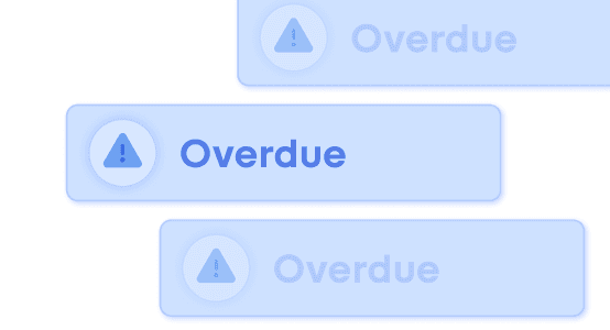
Primary actions need clearer affordances
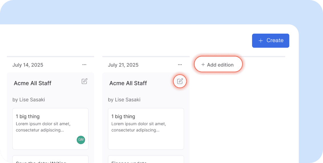
Most users expected to be able to view their full edition in the content editor by clicking on the title (rather than the edit icon button) and missed the “Add edition” button at the end of the list.
Solution
The shipped designs incorporate feedback from Product, Engineering, user interviews, and internal beta testing.
Solution
The shipped designs incorporate feedback from Product, Engineering, user interviews, and internal beta testing.
Solution
The shipped designs incorporate feedback from Product, Engineering, user interviews, and internal beta testing.
The Series Planner in production 🚀
The Series Planner in production 🚀
The Series Planner in production 🚀
Enhanced visual hierarchy and scalability
Edition titles and cards now feature distinct background colors to clearly define their boundaries. We replaced card-sized drop-zones with slim divider lines — significantly improving precision and speed when reordering cards.
Additionally, we repositioned the "Add card" button as a fixed footer at the bottom of each column, ensuring the primary action remains accessible even when managing longer editions.
Streamlined drawer editor
The drawer UI enables quick writing while maintaining planning context, featuring modern document editing capabilities like node menus, draggable elements, and contextual floating menus.

Streamlined drawer editor
The drawer UI enables quick writing while maintaining planning context, featuring modern document editing capabilities like node menus, draggable elements, and contextual floating menus.
Streamlined drawer editor
The drawer UI enables quick writing while maintaining planning context, featuring modern document editing capabilities like node menus, draggable elements, and contextual floating menus.
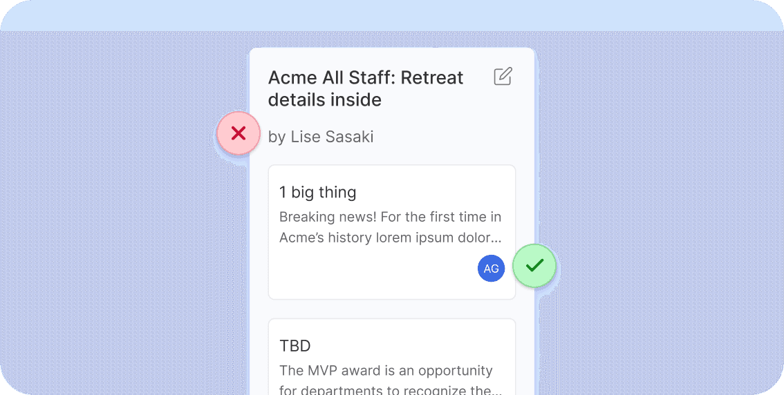
Optimized card management
After watching user sessions, we realized that the drawer opening automatically on new card creation felt slow and clunky. So we implemented inline title editing for new card creation to maintain workflow momentum. The final card actions include a prominent “Delete” button with secondary actions (duplicate, assign) organized within an overflow menu to reduce noise.
Impact
1
Transformed the product vision: This work reinvigorated internal confidence in the product direction, aligning the team around a clear, forward-looking vision. By delivering a feature that differentiates us in the market, we shifted from playing catch-up with competitors to leading with innovation.
2
Strong customer adoption: Within the first 60 days of launch, 48% of active customers adopted the feature, which validated its relevance and value in real-world workflows.
According to survey feedback, the planner’s biggest strength is how easily users can shift content around and stay on top of their broader communication strategy.
3
Boosted sales enablement: The feature opened up a new narrative for sales teams, allowing them to position Axios HQ not just as a writing tool, but as a comprehensive planning solution. This has expanded the product’s appeal and strengthened our competitive edge in demos with prospects.

